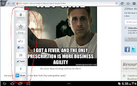
It seems ZDNet is more interested in annoying its visitors using Android to their web site. Perhaps their web designer does not know how to calculate the right place to put their 'toolbar' showing their comments, votes, Facebook likes etc.
An example using screen capture is probably the best way to illustrate this annoying problem that only seems to exist in ZDNet. I hope the disease does not spread to others.
It does not matter if I am using Firefox or Chrome in my Samsung Tab 10.1, the same annoyance appears when you zoom in on the page.
Here is what the page looks like without zooming in, the normal view:
The 'toolbar' is courteously tugged out of the way on the left hand side. But when you zoom in to the page, the toolbar begins to intrude on the main view - the article - as can be seen by this capture:
The toolbar circled in red begin to become the main focus of the page rather than any article. The bar moves to the right the more you zoom in to the page and becomes bigger, obstructing the more of the article. This is completely inconsiderate.
Can someone tell me what I can do or if there is any add-on to get rid of this kind of visual scum?


No comments:
Post a Comment